
There are many different ways to get home decor help. Hiring an Interior Designer isn’t an option for a lot of us. Some of us just need a jumping-off spot. Somewhere to get inspiration. In this post, I’m going to focus on color schemes. There are so many different ways a person can go. Not sure the direction to take.
Sometimes it’s hard to come up with a color scheme for your home decor and you need help. This post is going to give you some tips on how to choose a color scheme that is just right for you. You are going to be surprised at the way you can come up with your home interior color scheme.

- “This post contains affiliate links, which means I receive a small commission, at no extra cost to you, if you make a purchase using this link. Please see my disclosure for more details.”
Definition for Color Scheme
First, we will cover what the definition is for color Scheme. The Merriam Webster Dictionary says:
Color scheme: a particular combination of colors

Following that definition, it means we need more than one color for our interior. If only one color was used the home would be kind of boring. Alternatively, if a whole slew of colors were to be used it would look busy and mismatched. You want rooms that aren’t fighting with each other. Choose colors that complement each other and use them throughout your home. Stay away from the rainbow effect.
Contrary to that I do think children’s rooms should be what they want them to be. Let them enjoy their living space while they are in it. If you are looking to sell your home and are here getting home staging tips on room color, painting the children’s rooms back to a neutral color would be the best thing to do. Not everyone looking will have kids to fill the rooms.
When you’re ready to sell your home make sure you check out the other home staging posts.
“Ideas For Home Staging A House“ is a great one to start with.
Home Decor Color Aid
I promised you ways to come up with your color scheme. Let’s start with what I named this post “Home Decor Ideas, Food Inspired. You’re probably wondering what food has to do with it. Just think about it. Food needs to appeal to 3 senses. Food needs to taste good, smell wonderful, and look appealing. It usually will be passed over if it doesn’t look appetizing. Most of us watch the cooking shows and see how plating is a big part of the presentation to the judges. The plate of food needs to be appealing to the senses. Just like a color scheme in the interior of your home.
The next time you watch a cooking show pay attention to the food on the plate. What colors have been presented? If most of the food was brown look to see what they threw in for color. The judges weren’t presented with just a steak and baked potato. A garnish of cranberry puree and yellow butter added to the plate would look more appetizing. If they weren’t there it would look like a very bland meal even if it was delicious. There is a color scheme that is presented by a professional chef on each plate.
We all aren’t chefs. I’m sure not. But you can take inspiration from the shows streaming or your favorite restaurant.
Home Decor Inspiration
A fun idea is to use a dessert for the room inspiration.
For instance, think about a dessert that looks very appealing. Something that looks just as good as it tastes. How about an ice cream sundae.

Let’s tear it down. Espresso ice cream (off white or cream ), hot fudge (dark brown), and strawberries (red) (green) leaves and you can add the white for the plate if you want.
For example, below I will select decor that matches the color scheme to decorate a living room.
Flooring
Start off with the flooring. We will use what is already on the floor. In my case, there is Luxury vinyl flooring in a brown tone. This can be the hot fudge color. Adding a rug on top of the wood, tile or LVF adds some softness. If your floor is a color that is not included in the sundae it’s okay. Try to incorporate the flooring color into the accessories. For instance, the grey color in the spoon doesn’t look out of place at all. It’s just an accessory.

The next layer is a large rug to soften the feel of the roof for comfort. Nice vanilla off-white with some darker brown would be nice.

Another floor choice that adds some color right at the start is this Bisque Rug. It adds the ice cream and strawberry colors combined.

Furniture
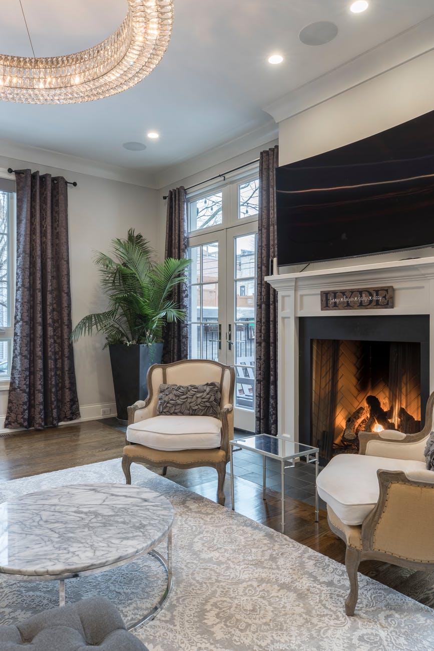
Furniture colors can go different ways. Figure out what color in the above picture you would want the furniture to be. Each color brings a different look to the room. Particularly with brown for the hot fudge, it will bring warmth to the room.


In contrast, go with the vanilla/ cream tone of the ice cream instead. The cream is a neutral color that goes with anything. This sofa can be used for years.


Accent chairs can match your sofa. Alternatively, you can choose another color from your dessert color scheme. In other words, you are able to use the red or green from the strawberries


With accent chairs, if you have more than one both should be the same chair or at least the same color family.
Accessories
Finally comes the accessories for the home decor help. The entire color scheme can be used. If you haven’t used one of the colors in the furniture or flooring make sure you add it here. In particular, if there is a color that you like better add more of it.


There are many ways to add the colors you want. Have fun looking for accessories that will go with your decor. If you find something that is the right color but doesn’t match your style. Don’t buy it. There’s a lot out there just waiting for you to find it.
The search is part of the fun.
This home decor help post is meant for you to have fun decorating your home. Clearly, I’m not saying to make your house look like your favorite dessert. Just use it for color inspiration.
Have fun decorating!